OECDplot
Detailed Features to be developed in OECDplot
Create a legend width parameter Charte Graphique
Description
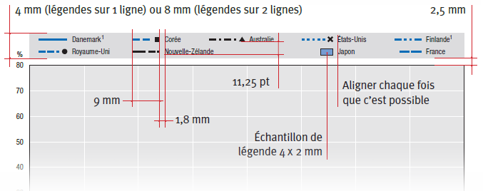
As you can see bellow the legend for all graphs in OECD publication must be of the size of the graph. Since there is not yet a parameter allowing to choose the width of the legend, you will need either to create this new parameter and intergrate it to ggplot2 or to find a reliable way for the legend to match the width of the graph.
POC using R

Create a specific look for the line symbol in legend
Description
The legend symbol describing the mapping of color and linestyle must have a precise size. Rectangles must have a size of 4 x 2 mm and line must have an horizontal length of 9 mm. You must find a way to make the legend symbol for lines match those requirement with out breaking the display of rectangle element in the legend. The rectangle element is managed for now inside OECDplot. You can see an illustration of that just above.
POC using R

Display a Y axis title at a correct position
Description
We want the axis title to be positioned were it is defined in the template but for now a bug identified by Hadley in ggplot2 prevent us from positioning the title on the right place. You will need either to fix this bug or to produce a way to position this title accordingly to the template.
POC using R

Adding Custom pie labels
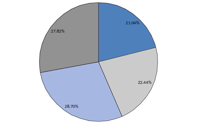
Description
Like in the example bellow we want to add custom labels representing the percentage of the slice inside the slice with the right font family, size and color.
POC using R

Implementing a radar Plot
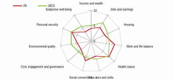
Description
We want to produce radar (spider) charts that respects the specification of the Charte Graphique.
POC using R

Implementing a High Low Plot
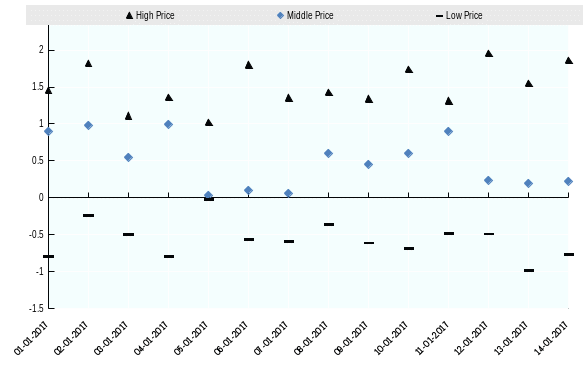
Description
We want to create a new plot type for the user that reproduce the High Low kind of graph that you see below. This graph is made to show 3 series 2 of them “surrounding” the other . The symbol used here are the same for all publication all that change is the color in use.
POC using R

Creation of a second y axis for ggplot2
Description
Users have requested the possibility to use a 2^nd Y axiswith a different scale from the first one.
POC using R

Scoping
Use Cases
Effective visualisation helps users in reasoning about data and evidence:
- data quality check
- comparison of analytical results
- internal communication
- reporting for data dissemination (e.g. “country notes”)
Requirements
Producing visualisations for analytical purpose shall be:
- cheap: faster to create from statistical tool than exporting data to use external tool
- intuitive: native function implementation, examples, documentation
- flexible: allow user to experiment with different mappings and representations
Current Tools
Software tools already in use by creators of data analysis:
- Graph for MS Excel: execute VBA macros on plots defined in MS Excel to standardise format (for publication)
- base plotting systems of statistical tools in use (Matlab, SAS, Stata, R etc.)
- enhanced plotting systems for specific tools, e.g. ggplot for R
Potential Developments
Areas where currently employed tools have shortcomings:
- produce graphics for publication together with data analysis
- cover static chart types that are not available from by MS Excel (e.g. treemap)
- interactive/dynamic content for websites (HTML + JavaScript)